Hello hello,
In March, I got the keys to my new home, and over the past 9 weeks, I’ve been steadily working through the flooring, electrical, landscaping, painting, carpentry, decking, aggregate, aircon, solar—and plenty of other smaller jobs on my long to-do list. It’s been a big process, but the home is coming together beautifully, exactly how I envisioned. I’ve shared some behind-the-scenes snippets on my stories, and one of the most common questions I’ve received has been about my flooring choice. So I thought I’d pop everything into a blog post so it’s easy for people to find.

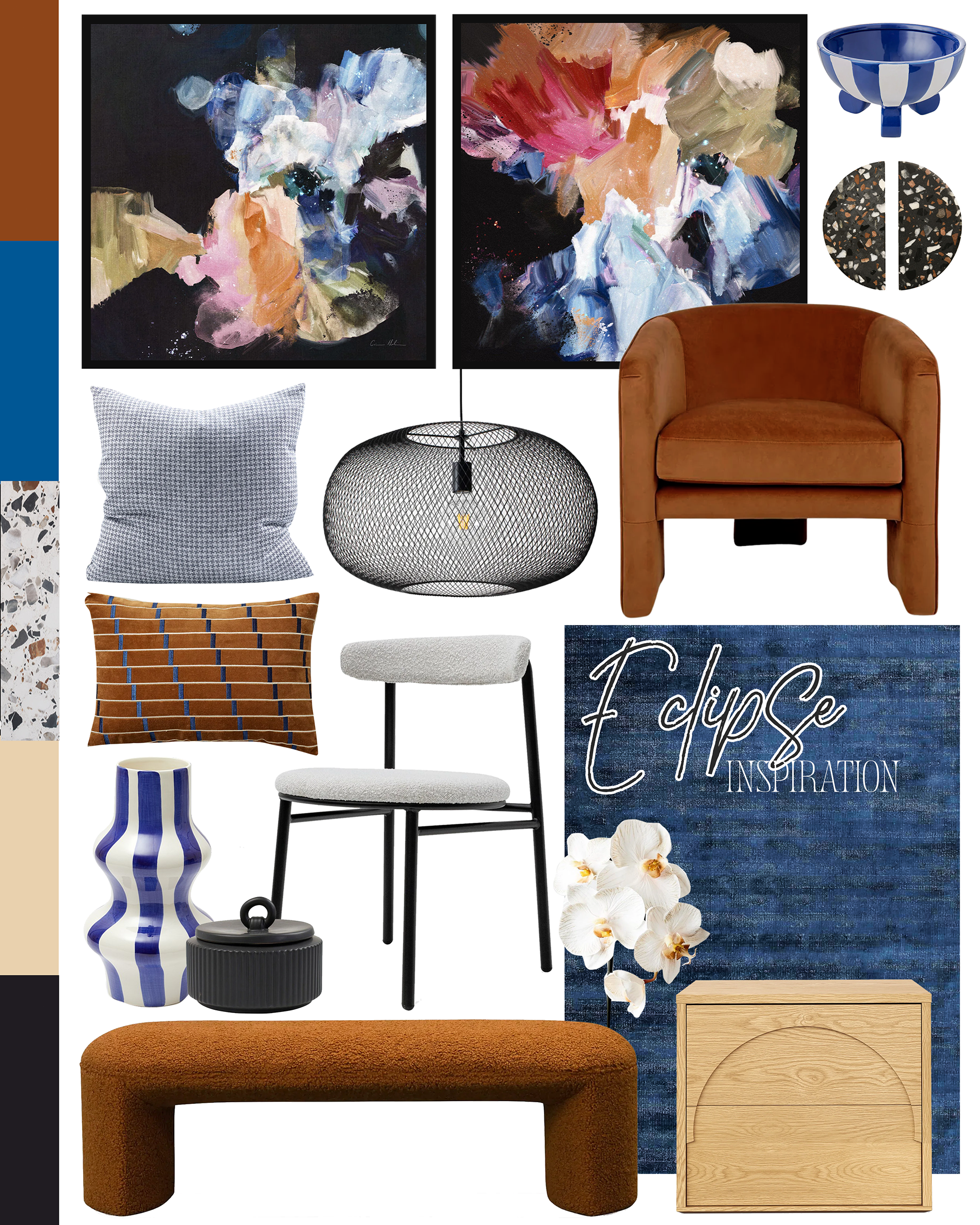
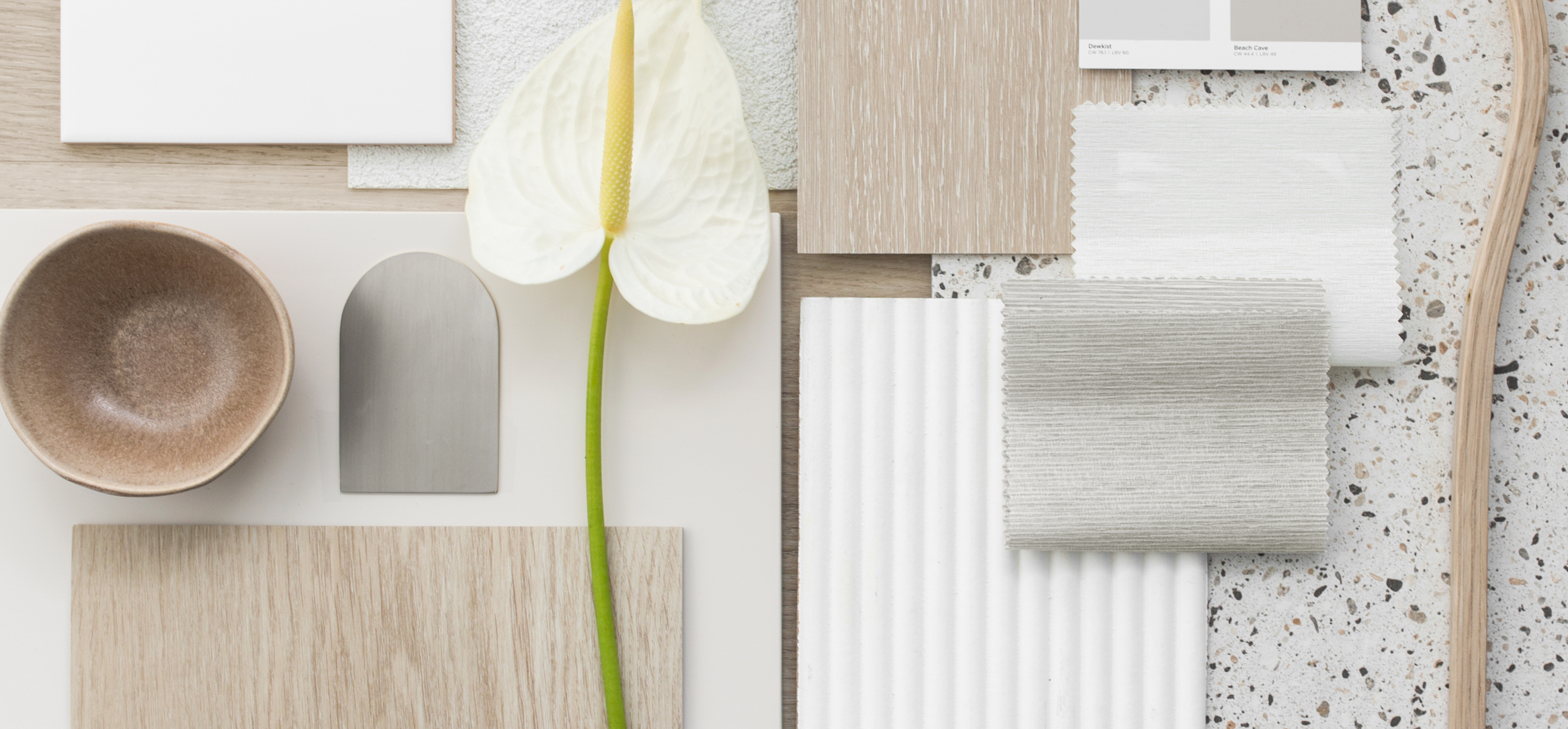
The Vision
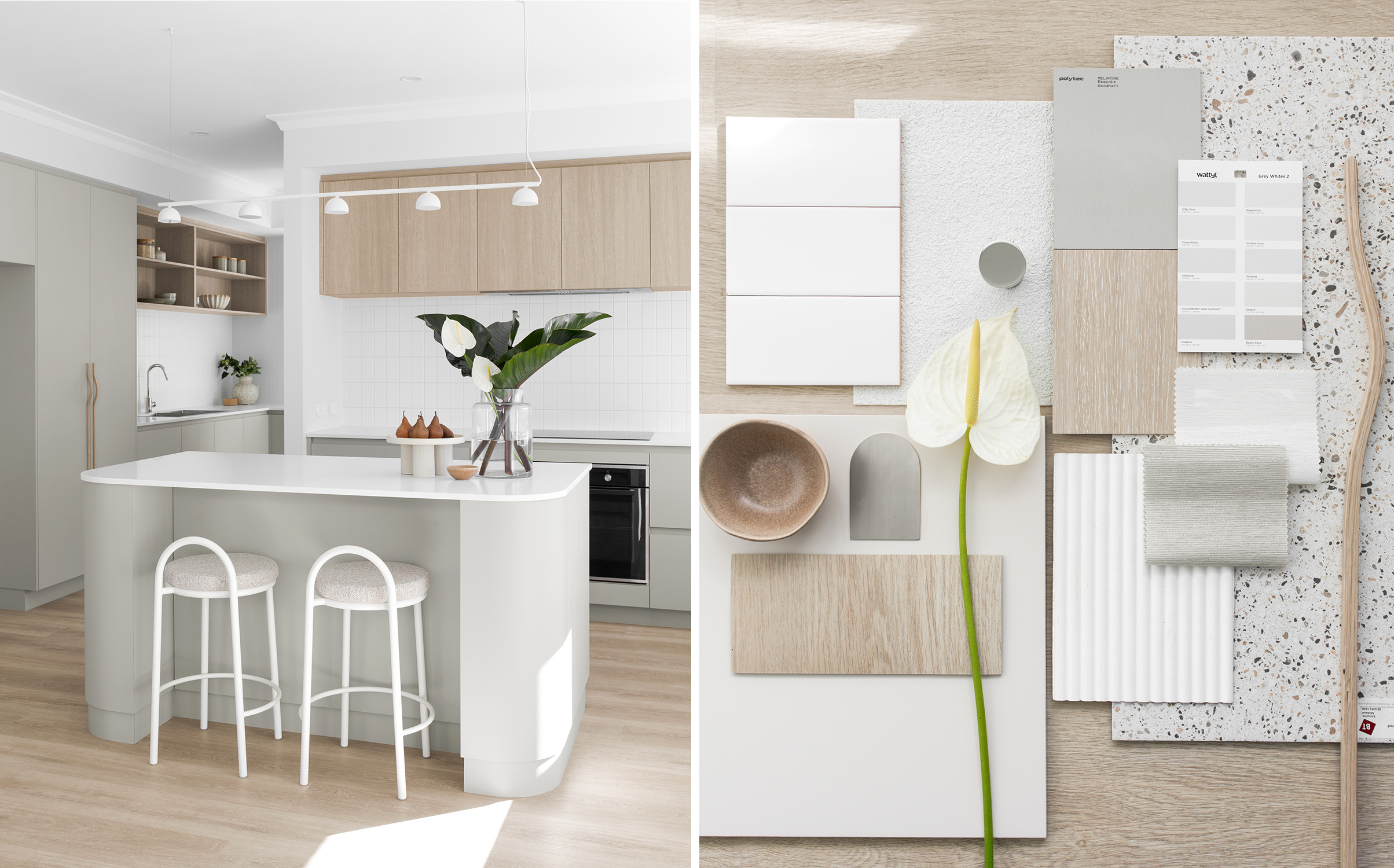
Early in the design process, I knew I wanted light oak tones for my kitchen and scullery overheads, feature handles, and open shelving. Matching that tone with flooring from the builder’s standard range proved tricky, so I chose to remove flooring from my build contract and sourced the perfect option myself.
Having lived in homes with hardwood, hybrid, and vinyl plank, I knew from experience that my favourite is glued down Vinyl Plank. It’s durable, looks amazing, and offers practical benefits that suit both personal living and investment potential
Why I Chose Glued Down Vinyl Plank (VP)
(Note: All points below refer specifically to glued down vinyl plank, which is the only application method I’ve used or specified.)
- It’s Quiet Underfoot: I’ve specified many homes with both hybrid and vinyl plank flooring, and VP is by far the quietest option. Since I decided to go carpet-free (even in the bedrooms) I wanted something that still felt peaceful and soft underfoot.
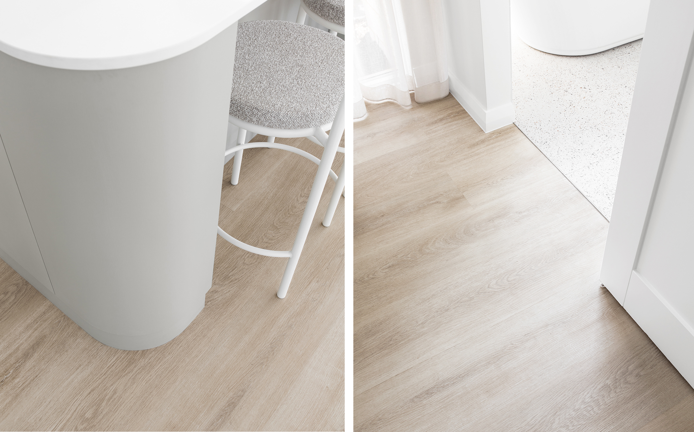
- No Scotia Needed: Vinyl Plank can be laid flush to the wall, meaning there’s no need for scotia. This creates a sleek, streamlined look and is especially important for kitchen islands or walls with with curved edges- where scotia simply doesn’t work well.
- No Expansion Joints: Unlike hybrid flooring, which typically requires an expansion joint every 10–15 metres, VP doesn’t need them. My home has a long 22 meter hallway from front to back and I really didn’t want a visible strip breaking that space up.
- Cleaner Tile Transitions: At the junction with wet areas, VP uses a tile trim rather than an expansion joint, giving a more minimal, seamless finish. While there are slimline expansion joints for hybrid, I personally find the tile trim cleaner and more discreet.
- Doesn’t Shift Over Time: Because VP is glued to the slab or subfloor, it stays firmly in place. Hybrid flooring needs a small expansion gap along the walls (which is why scotia is used), but this can sometimes result in tiny gaps forming between boards over time. VP avoids that issue entirely.
- Easy Repairs: If a plank ever gets damaged, it can be cut out and replaced individually without pulling up surrounding boards.
Why I Ruled Out Hardwood
I love the look of hardwood, but this home will eventually become an investment property, so I needed something more budget-friendly and low-maintenance. For that reason, upkeep, price, and durability ruled hardwood out very early on. The Vinyl Plank I chose still gives me the warm, natural look of real timber without the extra cost or maintenance that comes with hardwood.
The Flooring I Chose
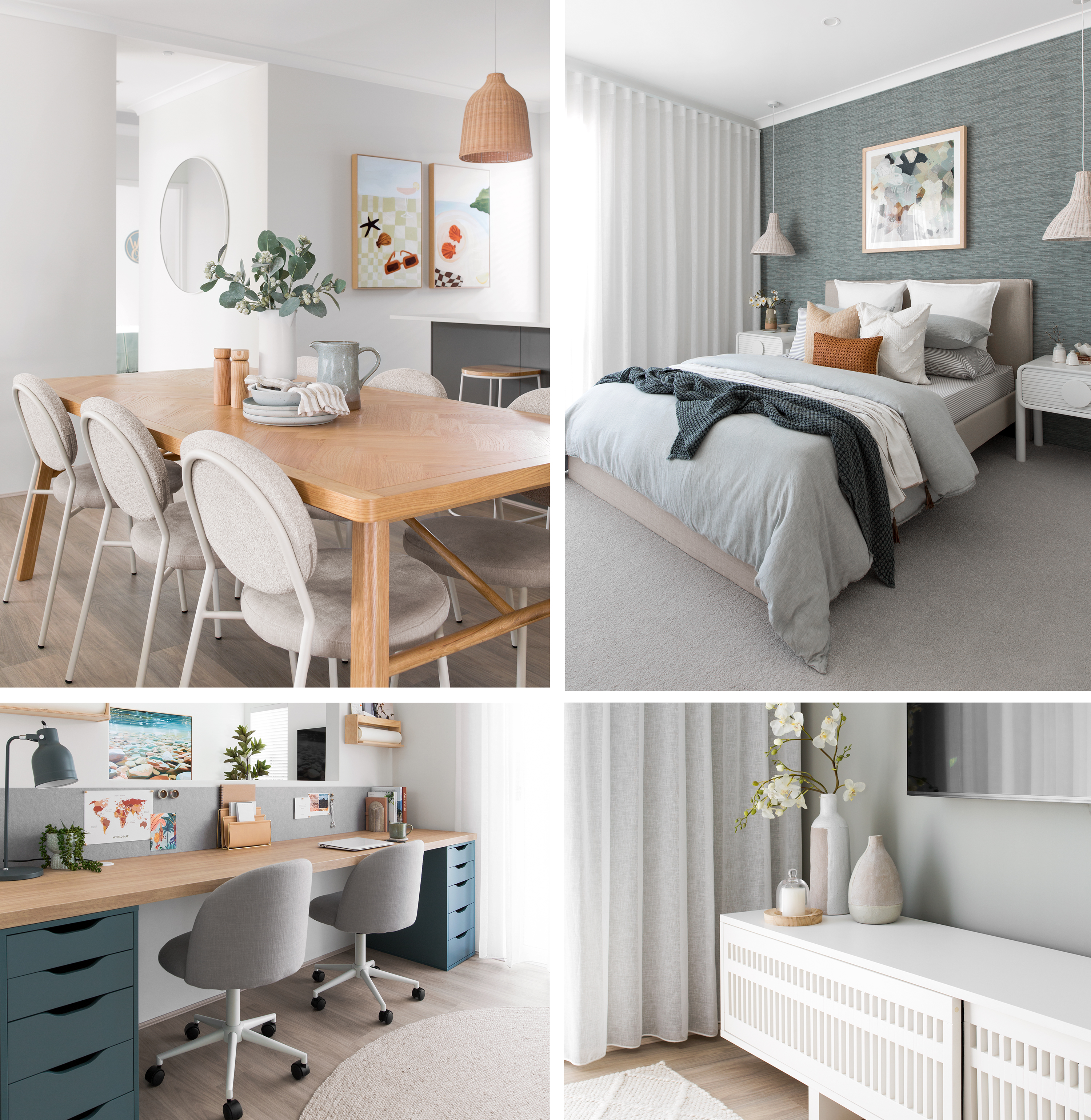
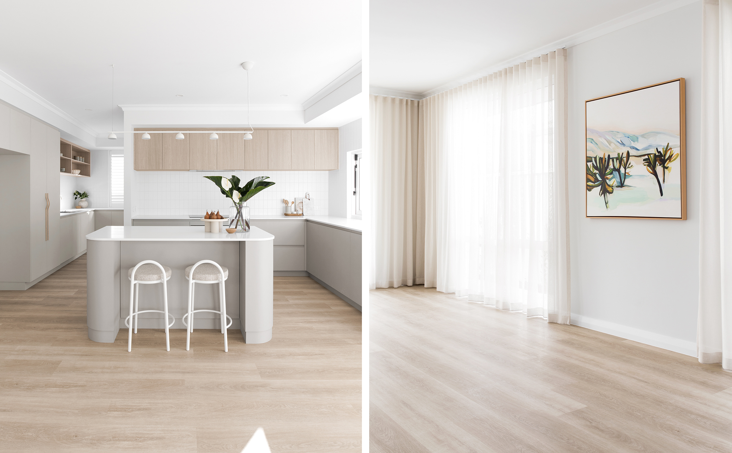
I went with the Godfrey Hirst Polaris range, in the 1500mm board length, and ordered free samples from their website (you can too here!). I landed on the colour Pearl Oak, and I couldn’t be happier with the finished result.
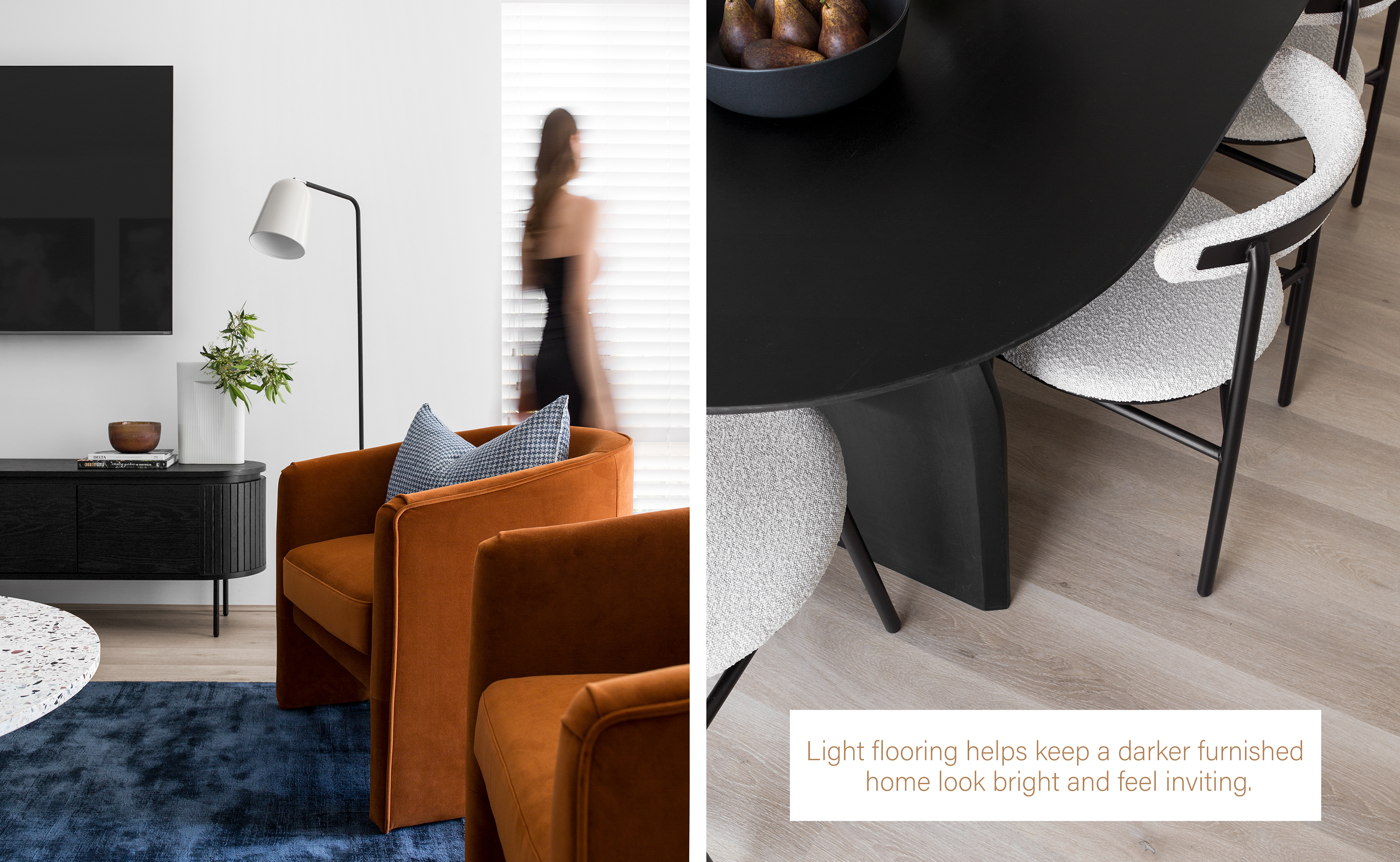
Pearl Oak is a beautiful light oak tone with low to mid variation in colour, grain, and knotting. It has the realistic look of timber without feeling too busy or patchy. If you scroll to the first image in this post, you’ll see how it looks in both warm light (kitchen) and shaded light (living/dining) -it’s incredibly versatile. I chose to skirt the whole house because my painter didn’t take the paint all the way down to the floor, but if you love that minimal, skirting-free look, this flooring supports that too.
If you’re considering vinyl plank for your own home, I hope this post gives you a helpful starting point! Let me know if you have any other questions- I’m always happy to share what I’ve learned along the way ♡