Everything Artwork

Heyaa,

I hope everyone is keeping safe and well! Perth has just come out of a snap lockdown but it was quite nice to get some writing done- since my last entry was about 10 weeks ago!! Today I’m going to shed some insight into how I plan artwork for a new home or client project. It is one of the most important areas I focus on when decorating the Homebuyers Centre Display Homes and one that I spend a lot of time on. The Homebuyers Centre family know exactly how much effort I put into selecting artwork for an upcoming display and have engaged me to share with you all some of my top tips and favourite suppliers.

From the colour palette, placement and theme, right down to the frame thickness, colour and depth- all of these factors contribute to a cohesive and flowing interior. One thing to mention is that I’m approaching this post from a full home fit-out point of view where the client wants their artwork cohesive. Some clients (and you might be one of them) prefer to hang sentimental or unique pieces in their home, which is always encouraged as well. Those special frames inject personality and individual style to the space and make your house feel more like a home.

Theme

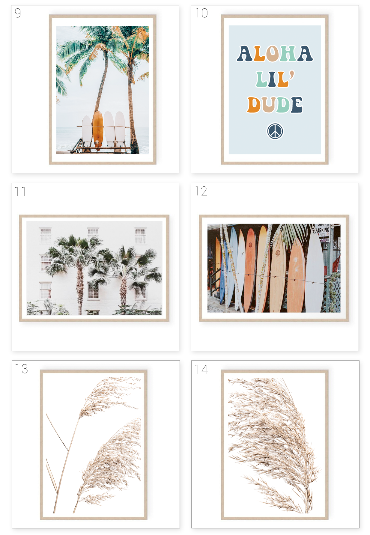
Artwork selections will depend on the brief I am given and the theme/direction we are styling the rest of the home. For example a ‘Coastal’ home will prominently feature palms, sandy shorelines, pampas and other natural flora, water/ocean/ waves, island villas, coral, shells etc… Whereas an ‘Urban’ home would have a more contrasted palette, with a slightly more masculine approach- think dessert dunes, highway roads, recycled brick textures and city-living subjects. If I were selecting a flora artwork for an ‘Urban’ style project I would hunt for cactus, succulents or native artwork, oppose to pretty florals. When a general theme is adhered to, the artwork will create more impact and emphasise your chosen interior style.

Colour palette

I’m very meticulous when it comes to colour palette but that’s just personal preference. There are no set rules! I personally love cohesion, but the ‘interior police’ definitely won’t rock up on your doorstep if you have mismatched artwork. If you have a fairly neutral interior palette, artwork is a great way to inject colour into your surroundings. You can then draw on the featured tones to style your space with complimenting decor and soft furnishings. Once the style, theme and colour palette has been chosen, I open up a blank document on either powerpoint, pages, photoshop (whichever is more convenient at the time) and start pasting images from artwork websites and suppliers. The document looks chaotic and messy, but having all of the potential pieces on one page helps me visualise if the colours work well together. I then start grouping them into rooms and eliminating any that don’t quite fit.

Placement

There are a few guidelines I follow when it comes to selecting and hanging artwork. Again, they’re not strict rules but they might be useful for you to refer back to when factoring in scale, size and placement of new artwork pieces.

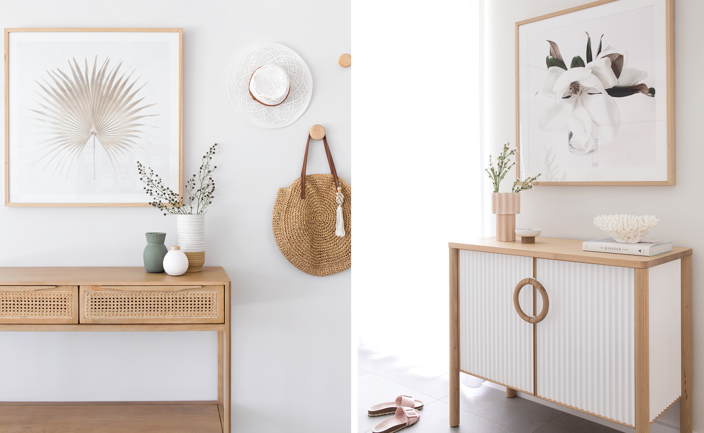
Hanging above a console or buffet

  • I like to keep the artwork size within the edges of the furniture piece underneath. They don’t need to line up with the edges, but I generally won’t extend the artwork past the furniture below.
  • If you have a relatively small console or buffet (under 1100mm,) a larger square frame will do the trick nicely. It should fill both the height and width beautifully and not leave too much of a gap between the furniture and bottom of the frame.
  • Statement mirrors also look great above consoles or buffets and this can help break up the rest of the room if you have other artwork in the area.

Hanging in a hallway or on a wall with no furniture / visual obstruction

  • Hallways and walls with no furniture against them can be difficult to dress because you have the full height, from floor to ceiling to factor in. You’re not obviously going to hang artwork at floor or ceiling level but there is a vast area to fill in the middle.
  • On a generous size wall, I prefer to hang two larger portrait pieces of art instead of one landscape piece. I feel that the wall is better filled with the length of a large portrait pair.
  • As an alternative, you could dress the wall with gallery images of your family or various artworks that tie in with your interior and style.
  • A landscape orientation is usually my last preference on a completely empty wall (with no visual obstruction) because often there is too much space left bare underneath the frame. I tend to only use landscape artwork in narrow hallways or if it is really large in scale and can fill both the width and height nicely. Even then, I would save something that big to use as a feature on a dining or living room wall.

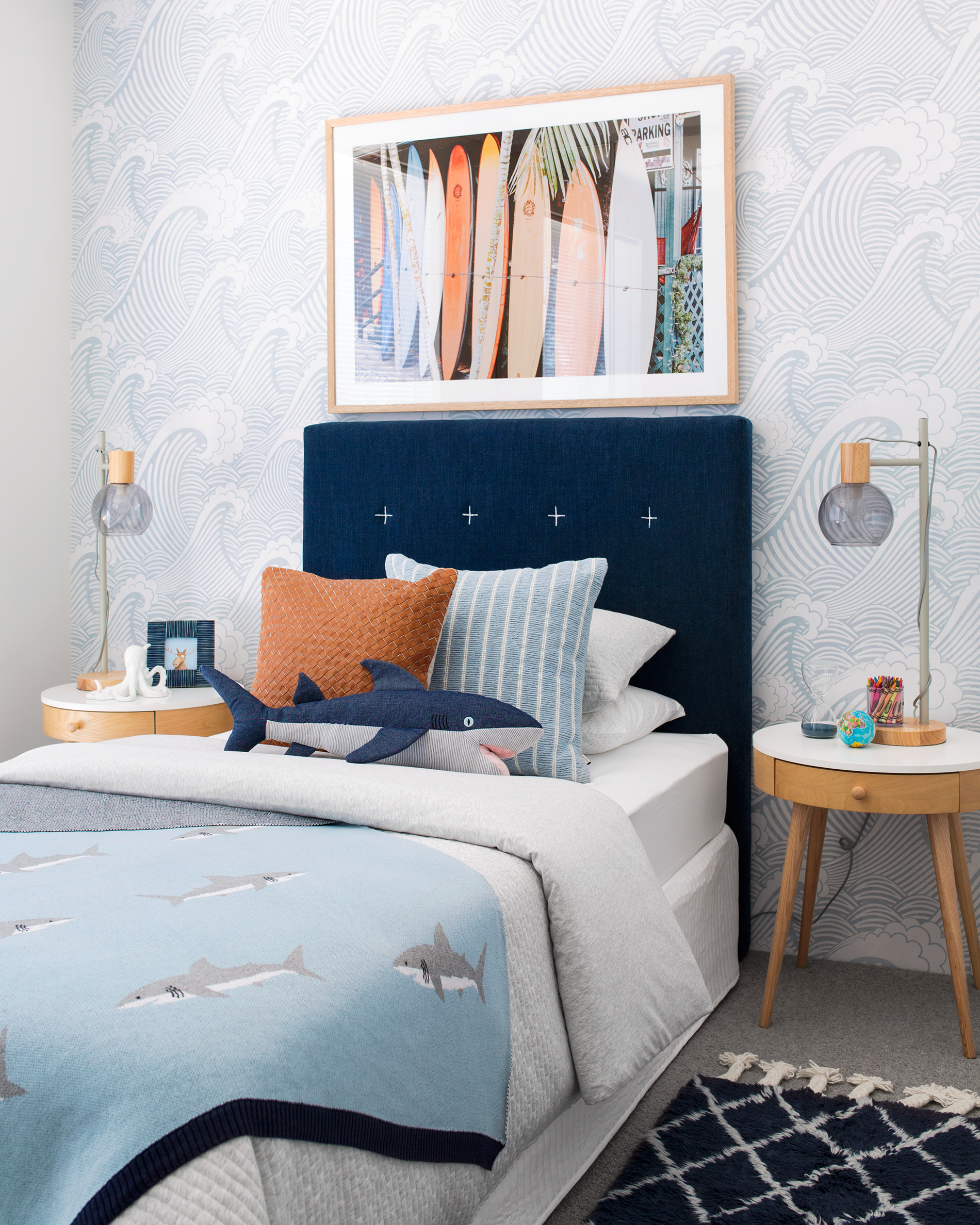
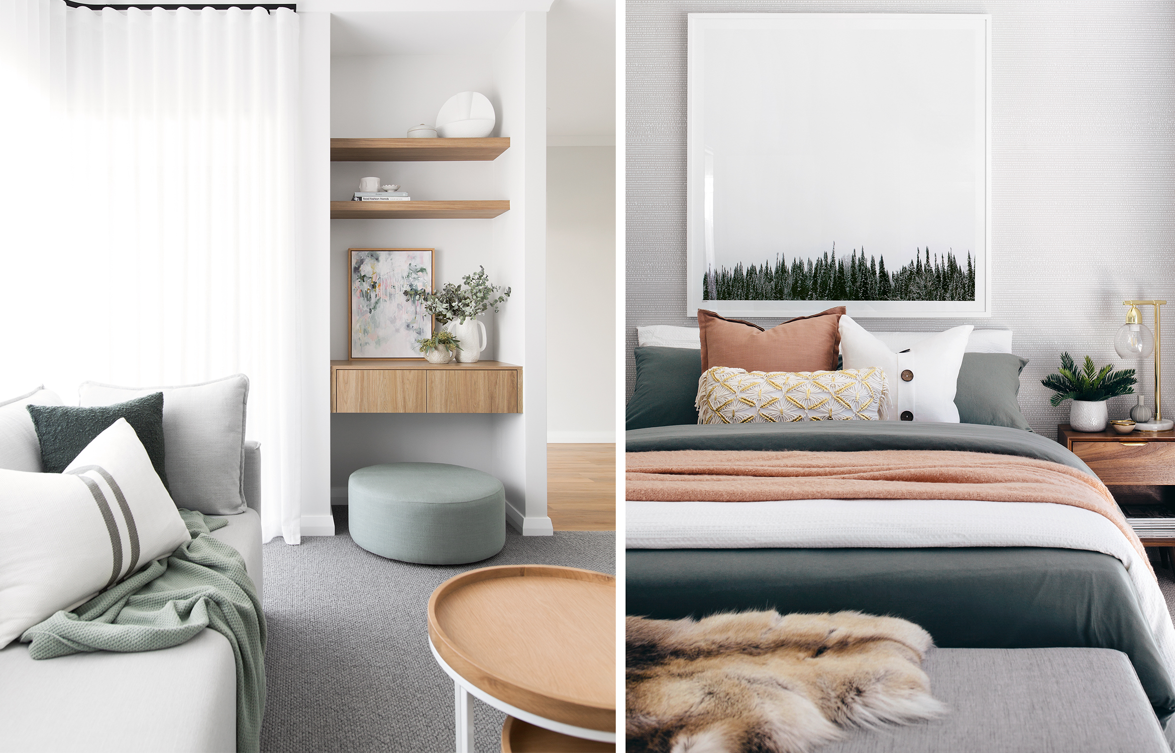
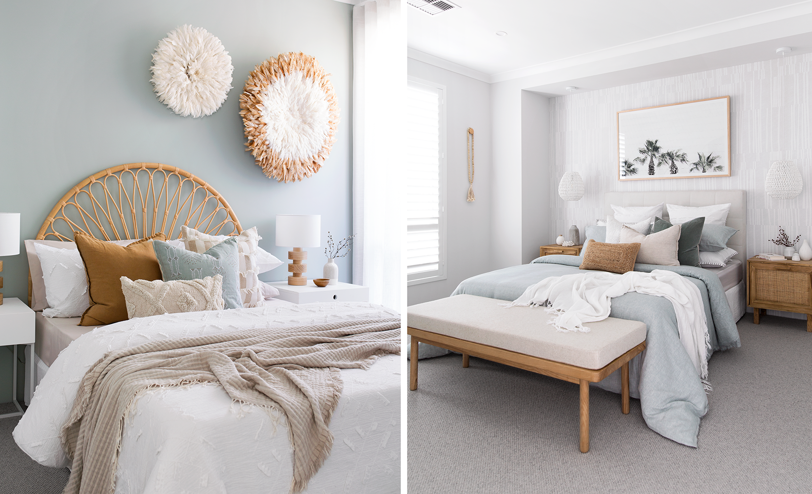
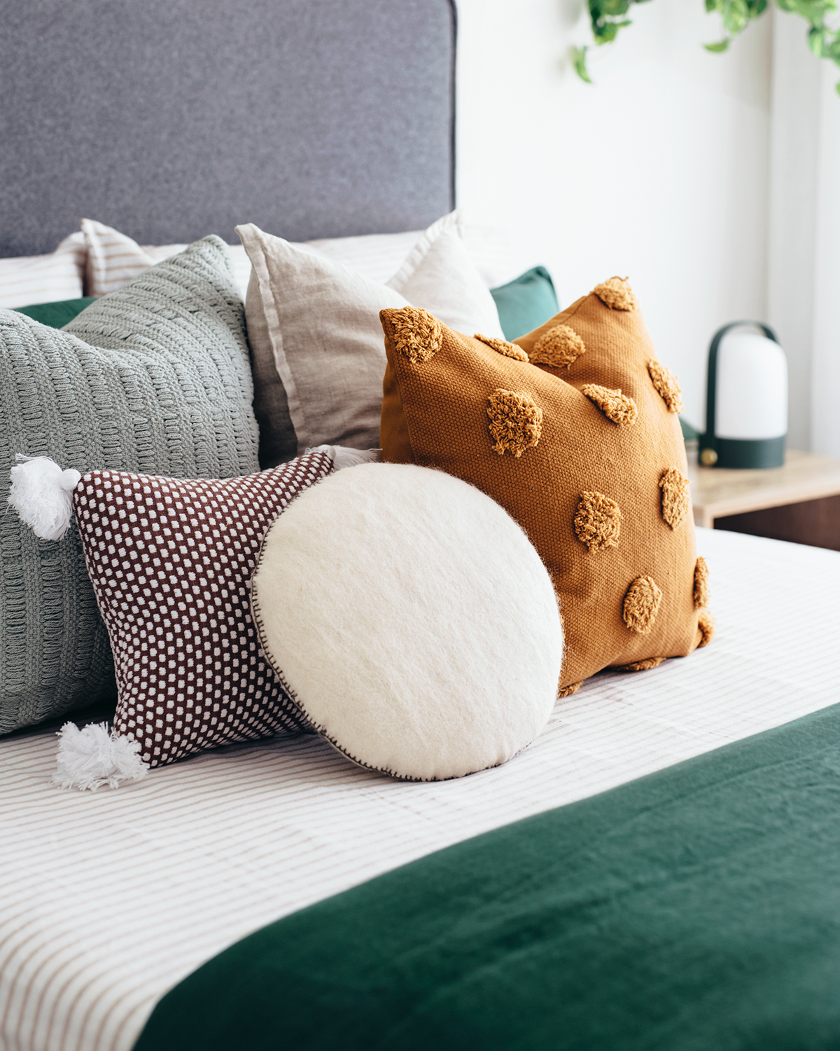
Hanging above a headboard

  • I have a personal guideline that I generally stick to when combining artwork, feature walls and pendants in a master bedroom. If the room has pendant lights and a feature wall, I will only use one piece of art above the bed.
  • Either the artwork or feature wall is kept understated and simple, otherwise there are too many features competing in the space.
  • If the bedroom has pendants and no feature wall, I will generally use two pieces of art (see below image,) or one striking piece of artwork to create more substance.
  • If the headboard is higher than 1300mm I will either select a landscape design with less height, or use a feature lining board or wallpaper behind the headboard instead of artwork.
  • Choose a particular colour from within the artwork to feature somewhere in your bedding layers, eg a cushion, throw or sheets. This keeps the room feeling harmonious and well thought out.

Above a sofa

  • I will either use two large portrait artworks as a pair or one (really large) landscape artwork.
  • This decision is usually made up by considering what wall space I have in the surrounding areas and if it is open plan.
  • For example, if I have a dining room wall (that cannot house any furniture against it) I would hang a decent size portrait pair here so the length fills the wall better. Then in the living room I would choose a landscape artwork for above the sofa since the furniture fills a majority of the wall space already.
  • Using a frame colour that compliments your furniture always looks really sleek and bespoke (see images above.)
  • If your posters or prints aren’t quite large enough to make a statement, consider getting your local framer to put a white mount around the edge. If you put a 60mm white mount on a 70x100cm wide poster, this would bump the overall size up to something like 85x115cm wide including the frame (depending on the chosen frame thickness.)

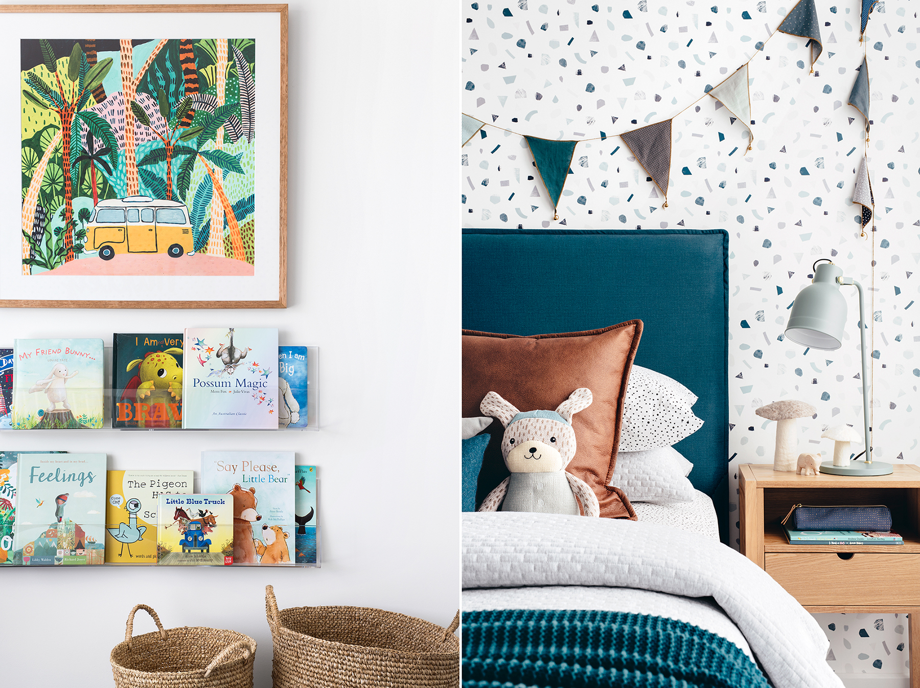
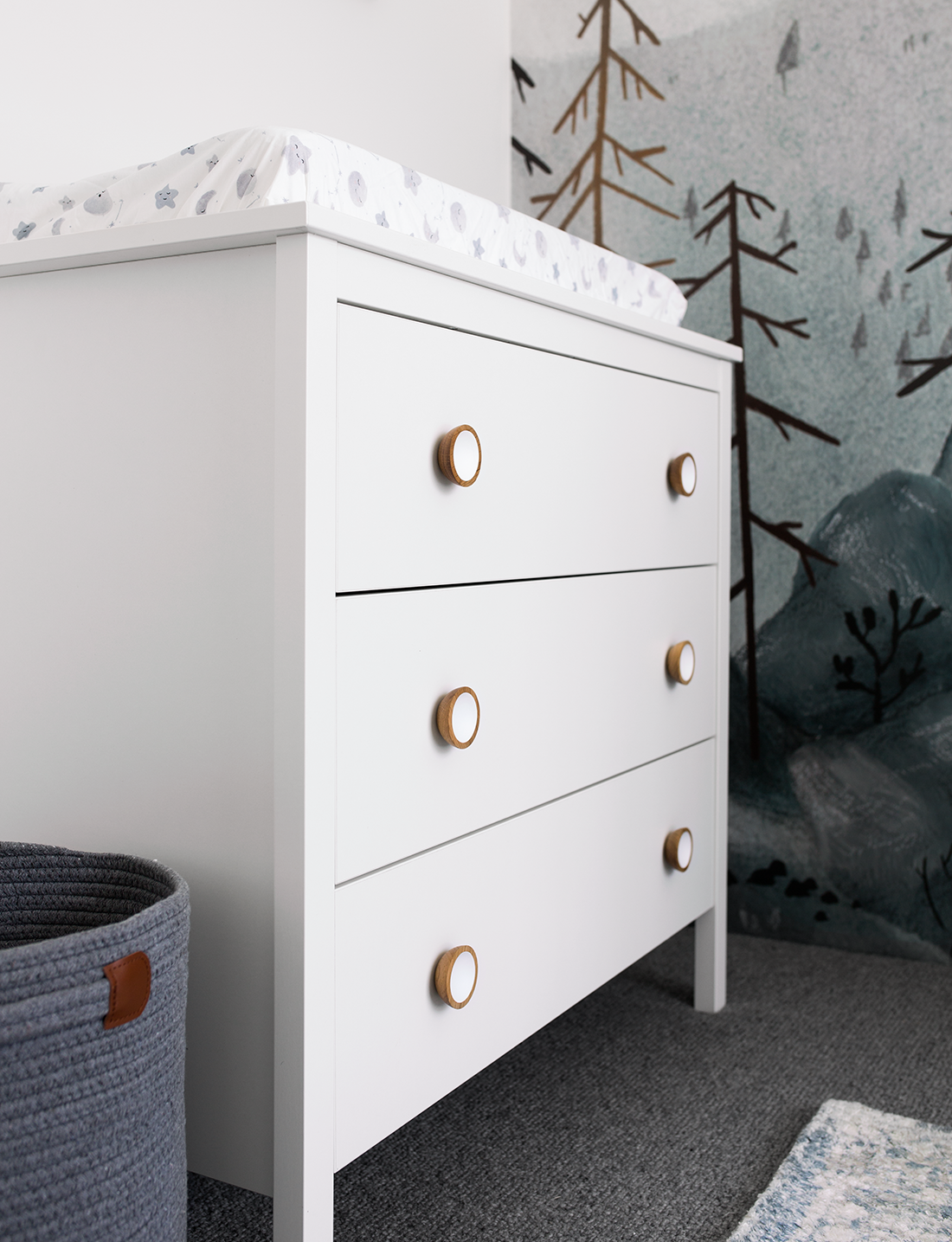
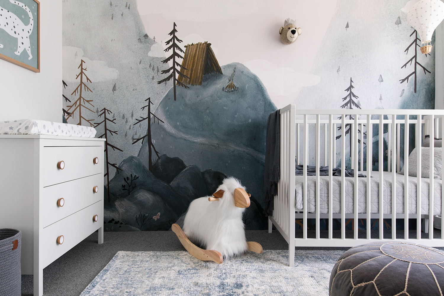
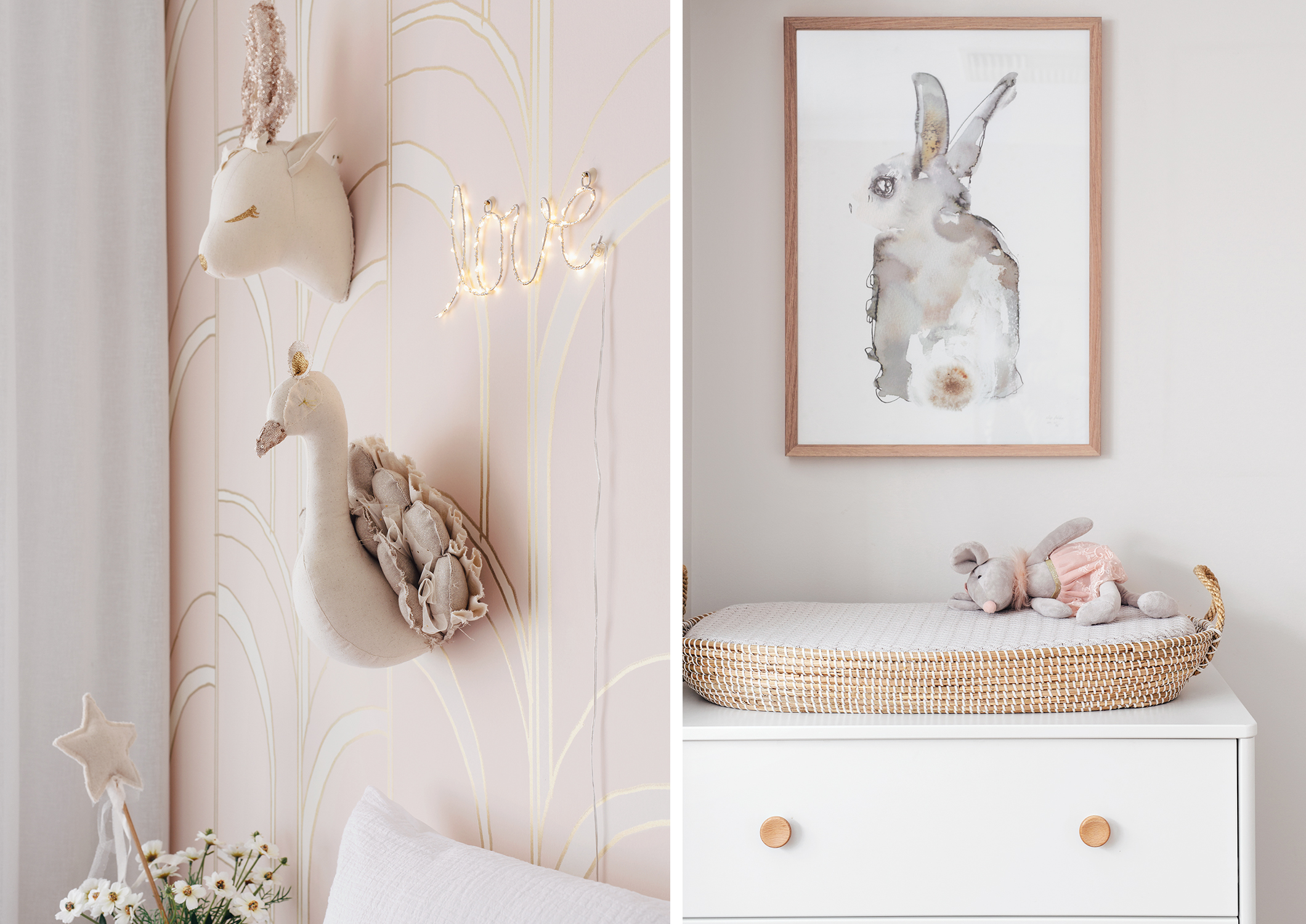
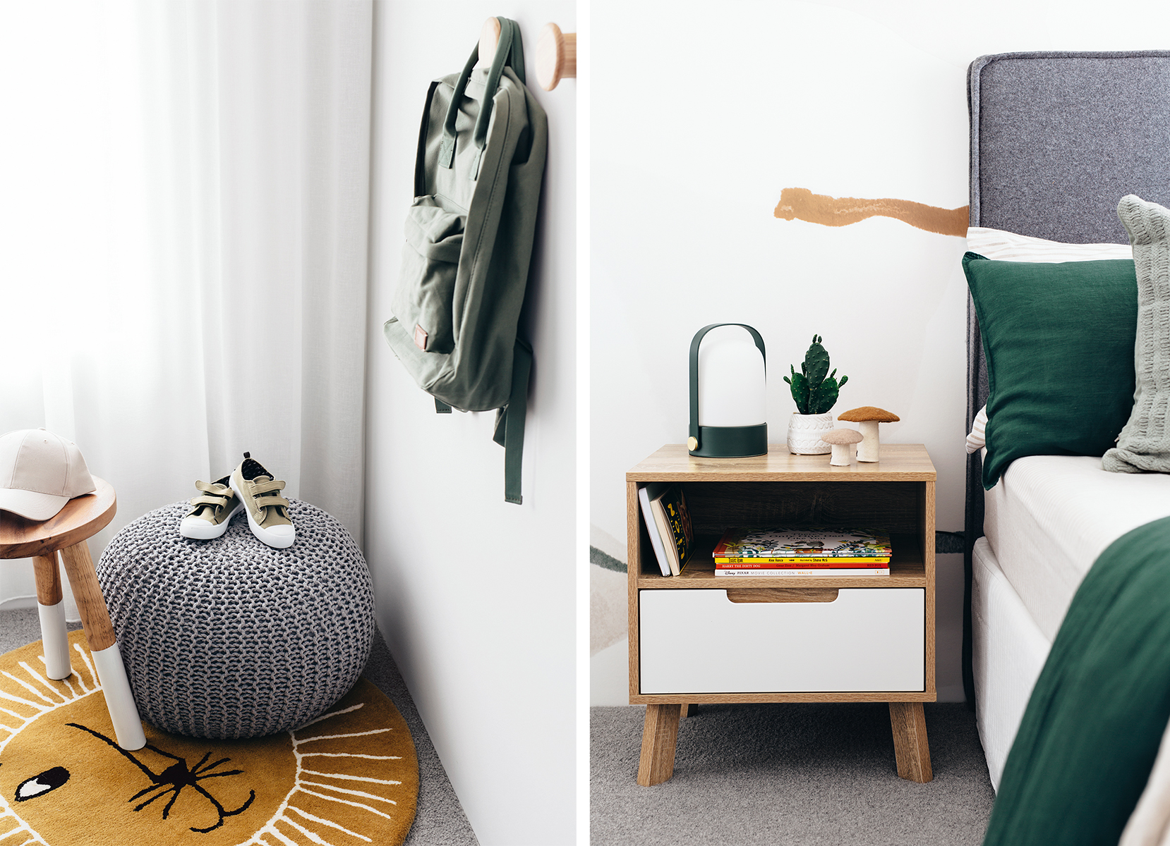
In nurseries or children’s bedrooms

  • Of course your number one concern should be your little love’s safety. You know your child and if you think they would touch artwork or pull items off of shelves, then it is best to have anything ‘hanging’ completely out of reach.
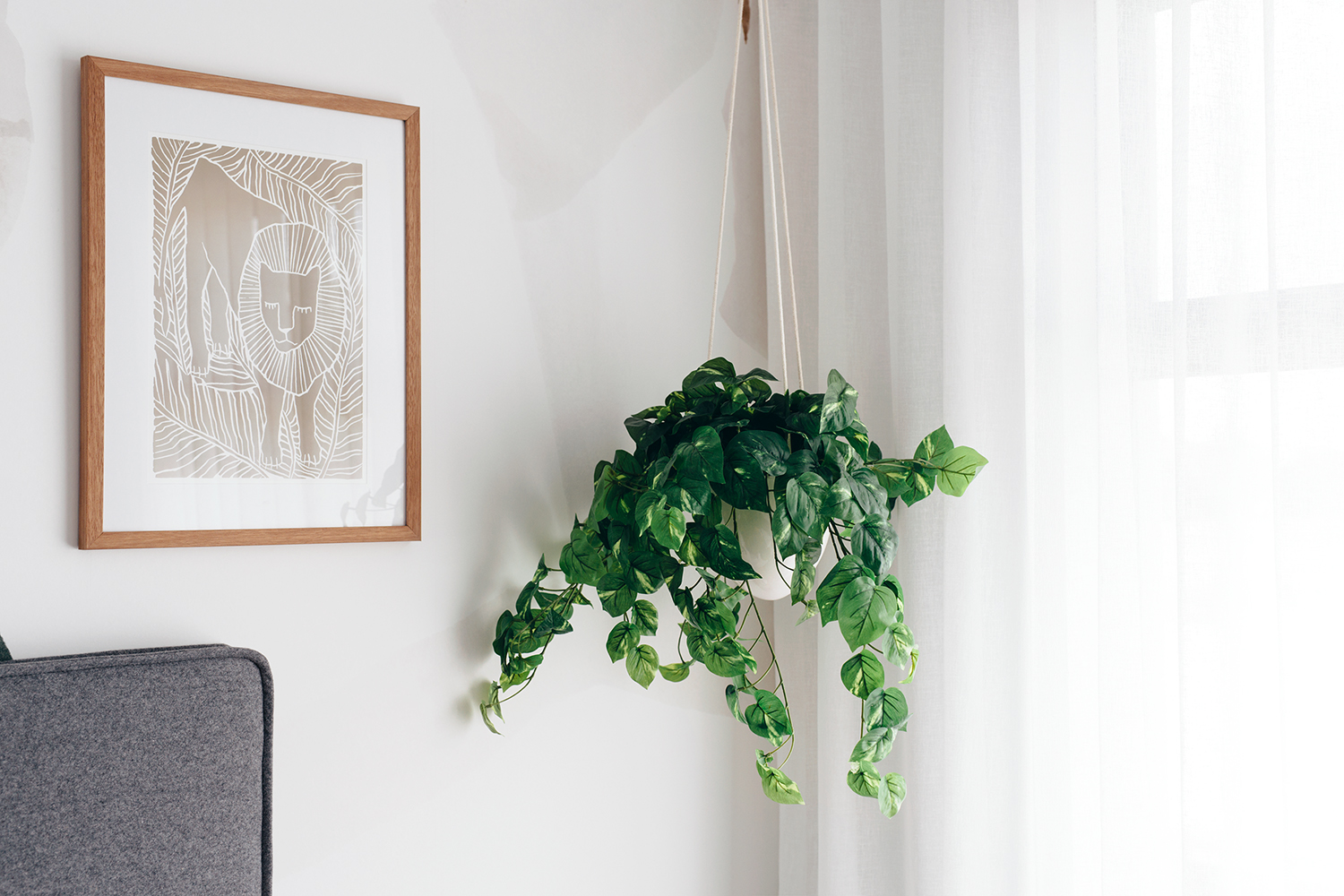
  • Hanging objects can pass as artwork because they add a visual layer without being repetitive. If you have used artwork already in the room but feel like a different area is lacking, try hanging a garland, cute mobile, canopy, a hanging plant, book ledges, some fun wall hooks, an age appropriate mirror, LED wall light, plush animal heads, a woven hall hanging, customised name plaque etc… The list of cute wall decor for children’s interior is endless and an example can be seen in the above and below images.
  • Have fun with colour and use artwork to emphasise your chosen colour palette.
  • Framing for children’s interior can be kept budget friendly because you might change the posters as your child grows and their personality evolves. A few of my go-to retailers for store bought poster frames are Target, Spotlight, Country Road, Ikea and Freedom Furniture. Target have a great timber range at the moment with a white return trim, that looks quite lovely. You can shop the Elena range here.

Budgeting for artwork

It’s no surprise that artwork can add up very quickly, especially if you appreciate original, commissioned or limited edition pieces. When furnishing the Homebuyers Centre WA display homes I take a more conservative approach when buying artwork, but I still allocate enough budget to purchase a few large and feature framed prints.

Start with your most seen walls and lived in areas like the master bedroom, entry, living, dining and theatre. Then work your way down to less visible walls like back hallways, offices, laundries etc. Allocate more funds for high traffic areas and less for the others. Here are my go to stores that sell a beautiful range of prints, posters and framed artworks.

  1. Olive Et Oriel
  2. Art and Framing
  3. Urban Road
  4. Desenio
  5. Greenhouse Interiors
  6. Boho Art and Styling
  7. Norsu Interiors
  8. The Print Emporium
  9. Frisky Deer
  10. Society 6 (for both adult and children’s posters)
  11. Leo and Bella (for children’s posters)
  12. Pretty in Print (for children’s posters)

If you want to stretch your funds further or decorate on a more conservative budget you can purchase printable files from various stores off Etsy and print them locally. Just make sure you read the description and check what the maximum print size is (some are not printable in large formats.) You can be even more savvy by purchasing printable sets, which offer a few coordinated artwork designs for a discounted price. Here are some of my favourite ‘Digital Wall Art’ stores that I have previously purchased from, or saved for future projects.

  1. Nolla Studio– TOP PICK- Soft photographic and abstract artwork
  2. Umaiana– Simplistic and neutral abstracts
  3. LilaXLola– Photographic art and baby animals
  4. Little Folk Printables– Children ‘s art and Landscape prints.
  5. My Dream Wall– Vibrant, fun mid century art
  6. Infintite Noon– Minimal line art.
  7. Baydreem– Photographic art and quotes.

Commissioned or original artworks

These are special and unique pieces because they are one off designs created by talented artists. They will obtain an ‘investment piece’ price tag compared to a printed artwork, but are authentic and one of a kind. A Commission is where you engage the artist to work on a customised artwork with your requests in mind, where an Original artwork is one the artist has created themselves. While it is notable to own an original or commissioned artwork, it is unrealistic for me to budget (even one) into a display home. Instead of shopping for an original, I will check if the desired artist has released a limited edition print of the same design. This is where the artist has had the artwork professionally photographed and a small number prints are available to buy. They are a great alternative if you value artisanship but cannot justify the price of an original or commissioned artwork. I wish I could feature all of the incredible Australian artists I know but that would get crazy long, so here are some of my favourites.

|| 1. Jessie Rigby || 2. Anya Brock || 3. Kate Fisher || 4. Prudence DeMarchi || 5. Adele Naidoo || 6. Tracey Mock || 7. Annie Everingham || 8. Katie Clulow || 9. Tegan Lloyd || 10. Beth Kennedy || 11. Dina Broadhurst || 12. Kimmy Hogan || 13. Jade Fisher || 14. Brent Rosenberg || 15. Sarah Kalidis || 16. Leah Bartholomew

Other handy tips!

  • Canvas prints/paintings are great for areas that have lots of natural light opposite or near where they are hung. This reduces an intense reflection you would get on a framed glass print.
  • If you’re set on a framed glass print, your local framer should have anti-reflective glass as an option. It’s actually very effective at reducing glare and reflections but it is a little pricier than your standard option.
  • When hanging two artworks side by side I usually ask my picture hanger for a 100mm gap. The gap completely depends on the size of the pieces but it’s usually between 80-150mm.
  • Miniature frames still create impact! Even though they’re small the point of difference in size creates a feature within itself, however placement is key! I would avoid hanging a Mini in the middle of a wall… Group it with other elements in the room, for example above a bedside table or next to an occasional chair.
  • Artwork or photo frames can absolutely be displayed on shelves or in cabinetry. It is a great way to bring in a contrasting element and break up the use of decorative items such as books and vases.
  • If you’re struggling with a room having too many pieces of artwork, consider incorporating other objects like a mirror, clock, shelves, wall decor (juju hats, straw or rattan pieces,) greenery or wall planter and woven wool hangings. This avoids using an overload of frames on the wall and introduces other shapes into the space.
  • Try and disperse the type of artwork you have in one area to avoid repetition- photographic/abstract/paintings/mirrors. For example in an open plan living and dining area (where all of the walls are visible at once,) I will plan an abstract painting pair for one space. Then I would select a complimenting photographic artwork for the other wall.
  • If you’re unsure on the size and scale of your artwork, you can use painters tape to mark out the shape directly on your wall. Be careful that you don’t pull your paint off though!
  • Alternatively, if you’re savvy with photo editing software you can always create a mockup of the space. Photograph the empty wall and drop in, then rescale the desired artwork.
  • Make sure you have weight appropriate wall plugs/fixings, especially for mirrors. You also might need to factor in whether your home is a brick or steel/drywall construction.

Well I hope all this artwork info has given you some insight into how I make refined decisions when buying and hanging artwork. Please feel free to ask any other questions below in the comments section. You might actually be able to help me out too… I’m always keen to discover new and talented artists or artwork/print suppliers to use in upcoming projects. If you have a favourite store that I haven’t listed above, please also link it in the comments section and I’ll have a sticky beak! Thanks for reading and we owe a big thank you to Homebuyers Centre WA for allowing me to share all this info with you. Thanks teammm!!

Have a wonderful week,

Tx

Homebuyers Centre WA has kindly sponsored this blog entry, based on my experience as their decorator and our own building journey. All thoughts, design work, styling and written content are my own.

Furniture and Continuity

Hey everyone,

Can you believe it?! There are only 5 weeks until Christmas! We will have a great little gift this year with the completion of our new home scheduled to finish up in roughly 9 days! Eep! My last entry was at the beginning of October and within 7 short weeks our ceilings, cornicing, windows and doors, sanitary fittings, cabinetry, tiling, stone and part of the internal painting has been completed. All of the exterior has been painted and our feature linings have been installed. We are really impressed with the build progress so far and we are beyond happy with how all of our selections look installed. Another big thanks to the amazing HBC team for making this journey so enjoyable.

With Christmas fast approaching and lead times blowing out as a result, I have now locked in window treatments, extra cabinetry, carpentry (skirting boards,) upholstery and wallpaper installation. I’ve also been sourcing some new pieces of furniture. We won’t be replacing everything because I still like a lot of things we own already, but there are a few pieces that will be too small in the new house. In this post I’ll touch base on buying selected furniture and give some tips on how to achieve continuity and flow in your home. So sit tight, or make sure you bookmark this as a ‘must read’ at some point this week or over the weekend.

I’ll start with furniture. For large ticket items like sofas and beds I always suggest to select a quality product, in a neutral tone. Try to avoid trending, seasonal colours when purchasing anything expensive, unless you really love it and will continue to like it when the trend passes. If you want to inject some vibrance into your home, you can easily style each area using pops of colour in decor, artwork, linen and textiles.

Top tips for buying a sofa

  • Look into sofa designs with removable or reversible seat and back cushions. This way you can rotate them to maximise the life of the foam or feather insert and you can conceal any unexpected stains or imperfections, by flipping it over.
  • If you want elongated sofa seat cushions, expect some sagging in the fabric over time. Stitching helps the fabric stay in place so a long span of cushion will naturally stretch in the centre more than a shorter seat cushion.
  • Consider your family dynamic and the way you will use your sofa before selecting a fabric. Larger/thicker weave fabrics are more likely to pull and catch on sharp objects like pet paws, jean studs, jewellery etc. A finer and tighter weave won’t catch as much but it will show up marks a bit more than a chunkier weave.
  • If you are wanting a leather sofa make sure you do your research on what category/grade of leather will be most suitable for you. Don’t be fooled by the word ‘genuine’ leather. It doesn’t represent a higher grade or quality, in fact it is less breathable and prone to splitting/cracking because of the thin top layer of PU or vinyl bonded on the top.
  • A sofa that is on glides (frame goes to the floor) is easier to keep clean in a darker colour because the bottom of the frame will get shoe marks across the fabric. If you’re wanting a lighter coloured sofa, consider a design on legs so there is no fabric at foot level.
  • If you have an open plan living area and the sofa is not against a wall, take into account the ‘backside’ of your new sofa. Some cheaply made lounges are upholstered to only be seen from the front and will have multiple panels of thinner fabric pieces stitched together to create the back… and not in the ‘luxe quilted’ way either.
  • When choosing a sofa with a modular or chaise option, consider your room layout and locate the chaise on the far side of where you enter the room. This will open up the area and ensure the space is accessible and usable.

I generally have all my sofas custom made here in Perth, but here are some of my favourite store bought designs that I have used or specified in projects.

|| 1 || 2 || 3 || 4 || 5 || 6 || 7 || 8 ||

Bedside tables

  • Bedside tables with drawers are practical for any bedrooms being ‘used.’
  • Side tables are a great, affordable way to furnish a guest bedroom, where bedside storage isn’t necessary.
  • Designs with a shelf can be aesthetically pleasing, but in reality can collect a fair amount of dust.
  • In my (tried and tested) opinion, one of the best features on a bedside table is a rim around the top edge. It is so handy as nothing falls off eg phone on the charger, reading glasses, books etc.
  • Try and purchase a bedside table with height in mind. Compare the height of your mattress to the height of the table so they are similar measurements. Double pillow-top mattresses usually look better with a taller bedside, whereas low-lying beds look better with shorter bedsides.
  • Be cautious of resting drinking glasses or water bottles on both veneer and timber bedside tables. Watermarks are common and are hard to fix on veneer products, so the best way to avoid them is by keeping a coaster nearby.
  • If you are looking into a hinged/door design, make sure you can specify opposite swing directions. If both hinges are on the same side, one will open towards the bed (rather than away from the bed.)

Some beautiful 1 and 2 drawer bedside table options are linked below. These are a few of my favourite designs at the moment and the first two have the brim around the top (that I mentioned above.)

|| 1 || 2 || 3 || 4 || 5 || 6 || 7 || 8 ||
Homebuyers Centre ‘Cove’ Display Home

Beds VS ensembles

Choosing a bed with a frame or an ensemble completely comes down to personal preference, but there are a few factors to think about before making a final decision. In the Homebuyers Centre display homes I mostly specify ensembles, paired with a headboard. The base of the ensemble doesn’t need to look pretty because it is covered with a bed wrap or valance, so as a result this is a more cost effective option for us. It also allows me to customise headboard designs based on the style and the colour scheme I want to adapt. In client projects I always gravitate towards a full bed, as it’s a more unified piece of furniture.

  • Bed frames are usually fixed to the headboard making it a more solid unit, in comparison to an ensemble/headboard pairing. In saying this the headboards I have custom made, feature a built-in wall mount option to secure it safely and prevent movement.
  • A quality bed will usually be more expensive than an ensemble setup.
  • With an ensemble you don’t necessarily need to have an upholstered headboard at all. You might want to create a feature wall with VJ panels, wallpaper or a boxed out plinth as your statement headboard.
  • Do you like the look of a valance or bed wrap being visible? Even if you go up a size with your quilt to create extra hang on either side of the bed, you’ll still see part of the valance or bed wrap somewhere around the perimeter (see above image.)
  • An ensemble base will either come with castors (small wheels) or fixed legs. Castors are good if you need to move the base around the room. However in a main bedroom where it get’s used more, the fixed legs will be more practical.
  • For either product, I always try to keep the headboard around 1100mm high. 1050mm is my go-to measurement because it allows enough height for europeans pillows but ample room above for a statement piece of art too. If I’m not using any art, I will arrange to have the headboard made at a taller height of 1200-1400mm.

Ensuring continuity and flow throughout your home

  • One way to create flow with your interior is to use the same timber tone throughout your home. RJ Living have a beautiful European Solid Oak range which extends across various products and this is a neat way to ensure the tone of your wooden furniture is consistent. You can shop their timeless collection below.
|| 1 || 2 || 3 || 4 || 5 || 6 ||
  • Using a ‘Colour’ palette is another great way to create continuity in your home. By dispersing pops of a similar colour palette into each room, it helps the overall interior feel connected and harmonious. You can decorate with colour in so many different ways for example in artwork, cushions, florals, ottomans, rugs, books, vases, textiles, linen, lighting and planters- to name a few. This pointer can also be applied to neutral or monochrome interiors by replacing colour with the use of repetition in texture and tone.
  • This next tip is not essential but I personally like to keep a majority of the interior hardware and trims consistent. Below is an example compilation of how you can create cohesion in your home between hardware, furniture, lighting and decor. I’m actually in love with all of the below!!
|| 1 || 2 || 3 || 4 || 5 || 6 || 7 || 8 ||
  • ‘Shape’ can also be cleverly used to keep your interior looking unified. ‘Curves’ are insanely popular at the moment and it’s soft, round form can be applied in many areas of the home. In lighting, mouldings, accent chairs, artwork, cushions, shelves, cabinetry handles – you name it! There are plenty of products on the market to inject the repetition of shape into each space, and it doesn’t have to be costly or permanent at all.
  • Similar to the previous dot point, ‘Pattern’ can transform a space and create flow in your home. Linear patterns have been trending for years but they continue to be a huge influence with new, innovative designs evolving. Lining boards like Easycraft Vj panels have been circulating in mainstream residential design for around 6 years now, but batten and half dowel cladding has quickly gained momentum with brands like Porta and Glosswood becoming increasingly popular. Kit Kat tiles are also a firm fave of mine, with many styles and finishes available. These materials use the repetition of linear pattern to generate a textured focal point and feature in your home.

Well if you’ve gotten this far, thank you for reading and I hope this content was informative or helpful in some way. If you’re a first time home builder, I have documented our journey from the beginning and included some shop the looks and handy tips in each entry. Feel free to navigate through them below.

Blank Canvas to Cosy Home

How to Make a New Build Feel Like Home Instantly Getting the keys to a brand new home is such an exciting moment, but it can feel a little overwhelming too. At my own key handover last year, I got halfway through the walkthrough and suddenly felt like I might be sick. Perfect timing, I…

Vibrant Tablescape Tips for Summer Celebrations

Happy December ✨ Somehow 2025 has absolutely flown by and suddenly we’re back in that warm, sun-soaked season of long days and holiday entertaining! This year (instead of a traditional festive table) I’m sharing a fresh summer setup in the Homebuyers ‘Tyla’ display home, featuring simple, elevated styling that you can effortlessly reuse for all…

Spring is here!!

Spring has officially arrived and the Homebuyers WA Tyla Display Home is blooming with fresh ideas to welcome the new season. Whether you’re planning your next home build or just looking for some inspiration, this home is full of clever ways to refresh your space. A Fresh, Inviting Exterior The Tyla’s soft green cladded façade…

It’s crazy to think that the next time I write a post, it will be from my new desk, in our new home!!!!

Have a fab weekend everyone,

T x

7 week progress shots
Cabinetry installed> Cornicing installed> Ceiling, doors, frames and cornicing painted> Exterior painted and linings installed> Stone bench tops in > Tiling complete>

Homebuyers Centre WA has kindly sponsored this blog entry, based on my experience as their decorator and our own building journey. All thoughts, design work, styling and written content are my own.

Aura Boy’s Room

6linebreakWelcome back!!

Today I’m thrilled to show you some more images of this vibrant boy’s room I created for Homebuyers Centre in their new Aura Display Home, located at 68 Muriel Court, Cockburn Central. I absolutely adore this room and thoroughly enjoyed designing, then bringing it to life. In this entry, you can read a little more about the process as I explain some of my design choices and product selections. You can also easily recreate this look at home with the linked ‘Shop the Look’ section below. linebreakpalette2linebreakMy starting point for this space was the ‘Fractile’ wallpaper mural. It was the foundation of my design and the room’s colour palette is drawn from the earthy green, ochre and sand tones featured in the wallpaper. When I found it on Scandinavian Wallpaper and Decor’s website, I immediately asked Lollo (nicely of course) to customise the measurements for me. Once we confirmed and made the order, I began choosing artwork and linen to compliment the space and work back with the mural.

For the main bedding I chose the Ivy Vintage Wash Quilt from Adairs and paired it back with a simple white/linen pinstripe sheet combo. I then used a variety of different size cushions, with mixed textures and earthy tones to position on the bed. The texture helps create a warm, cosy feel and the chosen colours give the room harmony because they are cohesive throughout the space with other elements, like the art and decor.linebreak1linebreak

Aside from ‘colour’ the other two main elements of design I focused on were the emphasis on line and shape.

The use of a rough, illustrated line is repeated throughout areas of the room like the wallpaper, rug, sheets and artwork. I then also used a circle/ round shape multiple times, for example in the rug, cushions, ottoman, wall hooks etc. By emphasising these elements through repetition, it ensures the room is balanced and not visually overwhelming.

I hope you all like this room as much as I do! Please feel free to shop the look below, or if you’re located in Perth you can check out the Aura Display Home in person- details here.

Much Love, T ♡

linebreak34linebreakstllinebreakshopthelook|| 1 || 2 || 3 || 4 || 5 || 6|| 7 || 8 || 9 || 10 || 11 || 12 ||linebreakstl2linebreakshopthelook|| 1 || 2 || 3 || 4|| 5 || 6 || 7 ||linebreak

Paint- Solver ‘Cape Horn’

Carpet- Trevors Carpets ‘Conandale Colour 930- Grey Drift’

Sheers- The Blinds Gallery ‘Warwick Corfu Moonlight’

Please Note- If something is linked to the main store (rather than the direct product) it means they are out of stock online but it’s always worth calling your local store to double check their stock levels. The headboard can be custom made through me. The side stool and the ottoman were sourced through a furniture supplier so unfortunately I don’t have links for those two items, sorry.linebreak5All images are the property of Tarina Lyell T/A Oh Eight Oh Nine and must not be used or published in any way without written consent.linebreak

Magical Village Nursery Reveal

9.pnglinebreakHappy December everyone!

I hope you’re all well and enjoying the festive season so far! Today I want to share a beautiful nursery that I recently completed in the new Homebuyers Centre ‘Vienna’ Display Home. As most of you know, I love to incorporate a few affordable products into my designs so I can spend more on features within the room that will create an impact. I’ll run through some of my selections and explain why I have chosen these pieces as part of this sweet nursery space.

I usually try to save the most money on furniture pieces in nurseries and children’s bedrooms. This is because, in reality as children grow we accomodate their needs and purchase larger/ more appropriate furniture over the years. Our babies outgrow their cots, change tables, rocking chairs, toddler beds, even single beds. So with this in mind, I always try to make budget friendly choices, that are still practical and functional for the client.linebreak5linebreakThe Koppang 3 Drawer Chest from Ikea ($199.00) is a great option if you’re looking for an affordable change table that can also be used as a dresser. The height (I find) is way more practical to change a baby’s clothes/nappy than the Hemnes Dresser , however the Koppang only comes in the 90cm size. I then shopped online for some cute handles that would compliment the rest of the room and make their own unique feature within the space. I purchased these Oak and White ‘Wok’ knobs here ($14.00 each.)

If you do purchase the Koppang Chest as a change table you will need to buy a slimmer change pad. I got the Homebuyers Centre one here and it fits really well for both the width and depth measurements. Another plus is that you can use a bassinet sheet as the cover! This gives you more variety when shopping because I find change pad styles quite limiting. Please Note- I know a lot of people use the mat resting on their change table or chest, however, it is always strongly recommended that you secure it to the unit to prevent any slipping.linebreak4linebreakThe next product I was going to write about is the Hayden Cot from Pottery Barn Kids but it’s sold out, sorry! Never mind, I will show you some other designs that are nice, neutral and budget friendly!! Don’t get me wrong either- I love a branded cot (like Oeuf, Babyletto or Ubabub) but sometimes budget does not permit and that’s when I start hunting for something just as appealing- without the higher price tag. Below are 6 great cot options that won’t break the bank- All coming in at under $500.00 each!linebreakCotsUnder500.jpglinebreakshopthelook|| 1 || 2 || 3 || 4 || 5 || 6 ||linebreakWhile on the topic of bedding, if you’re not too fussy, you can pick up a brand new cot mattress for under $90.00. I personally have never bought an expensive mattress for Chet and he slept through the night consistently from 3 weeks old. Even now he has a single size mattress from Amart Furniture and we’ve had no issues with it. Check these two links from Kmart ($89.00) and BigW ($90.00) for an affordable cot mattress- Just double check your measurements before purchasing.linebreak6linebreakNow to shelves! I’m pretty sure the MELLÖSA picture ledge are a fairly new Ikea design (to Perth anyway) because I only just discovered them a few months back!! They make a great, affordable book shelf, look super sleek and in comparison to other acrylic designs on the market- are a fraction of the price ($16.00 each.) Some other budget friendly purchases in this nursery are the Ottoman from Spotlight ($110.00,) Canopy from Adairs ($99.00) and Throw from Kmart ($12.00.)

With all these small savings, I was able to purchase the gorgeous Maison Village wallpaper mural from Scandinavian Wallpaper. It’s beyond amazing and even more magical in person. It is a feature within itself and I feel like it is a design that will easily adapt as your child grows. I also allocated a bit of extra money to use some ‘Shop Small’ decor items like the Plush Toys from Spinkie, the Bear Head from Leo and Bella and the Hot Air Balloon Pendant Light from The Little Interior.linebreak2.pnglinebreak3linebreakIf you’ve come across any great money savings ideas or affordable products for children’s bedrooms/ nurseries, please feel free to add them below in the comments section. I, and many others would love to read all about it 🙂

If you’d like to walk through the ‘Vienna’ Display Home in person, it can be located at 16 Quartz Road, Treeby, Perth. More details including opening times can be found on the Homebuyers Centre website.

Much love,

T xx

linebreakshopthelook|| Wallpaper || Cot- Unavailable || Dresser || Handles || Change Pad || Bassinet Sheet/ Change Pad Cover ||  Rug 160x230cm || Chair || Canopy || Ottoman || Hot Air Balloon Pendant || Bear Head || Plush Toys || Throw || Cot Linen || Shelves || Rocker ||

Sheer curtains are from The Blinds Gallery – Fabric – Warwick Corfu Moonlight

Carpet – Trevors – Victoria Carpets Elmview 51 1403 Murry Grey

Paint Colour – Taubmans – Barely Beige 1/4 Strengthlinebreak8linebreak

Shop the Skater Look

BanksiaGroveBoys.pnglinebreak

Good evening everyone!

I recently completed this fun, skate inspired bedroom for Homebuyers Centre WA and I’m so happy with the way it turned out. I have compiled a list of the supplier details and created a ‘shop the look’ section below with clickable links for anyone wanting to source items from this vibrant boy’s room.  You can also check out this space in person at the new ‘Ascend’  display home in Banksia Grove (address and details here.)

In the coming weeks I will write a separate blog entry on designing fun-filled kid’s bedrooms and how to style with colour. It will be quite informative and full of handy tips, so stay tuned.

Have a lovely week!

T x

linebreak

Sheer Curtains- The Blinds Gallery in ‘Warwick Sicily Slate’ fabric

Paint Colour- Taubmans ‘Barely Beige’ 1/4 strength

Carpet- Victoria Carpets ‘Everest Mirage’

linebreakShopthelook.pnglinebreak

shopthelook

|| 1 || 2 || 3 || 4 || 5 || 6 || 7 || 8 || 9 || 10 || 11 || 12 || 13 || 14 || 15 || 16 || 17 || 18 ||

linebreak

Styled images are the property of Oh Eight Oh Nine and must not be used without written consent. 

The best coastal art prints

theatre2linebreakHey everyone!

Recently I have been uploading snippets of a new coastal display home I completed in March and a recurring question I keep getting asked is, “where is the art from?” Last night, I compiled a list of prints that I purchased for the home, including easy shopping links so you can steal the look and easily find the supplier details. Most of the artwork is available in various sizes and framing options are also available.

Below are a few tips I follow when buying artwork to ensure they are all consistent with the theme of the home.

I order all my prints unframed and get them framed up by George at Demmer Gallery in Osborne Park. This keeps the shipping cost down because to get a framed print shipped to Perth is much more expensive, purely because of the weight. I also buy some ready made poster frames from Spotlight for prints going in ‘non-feature’ areas of the home.

One of the most important things I consider when buying art is if the colours and tones all work well together. So for example, in this home I wanted soft, muted blues and natural tones, with an exception of the boy’s bedroom. If you purchase a few posters from one photographer or one store, you’ll notice a lot of their post production, presets and filters are the same so the colours are always quite similar… This is great if you want to use two prints side-by-side.

I buy a lot of landscape artwork because I like to put prints in the bathroom, ensuite, laundry and hallways. They fill the wall space better and create visual interest in areas that are sometimes left bare. If there is a large wall to hang artwork on, I will always look for a matching pair of portrait prints. I find having two large portraits, fills the wall better than one large landscape… unless it’s above a sofa or bed etc!

Well they’re my top three tips for purchasing artwork and ensuring you keep a consistent flow throughout the home. Feel free to shop the featured coastal prints by clicking on the corresponding numbers below.

Take care,

T xlinebreak1-3.pnglinebreakboyslinebreak2-3.pnglinebreak

shopthelook|| 1 || 2 || 3 || 4 || 5 || 6 || 7 || 8 ||  9 || 10 || 11 || 12 || 13 || 14 ||

linebreak Alkimos.pnglinebreakStyled images are the property of Oh Eight Oh Nine and must not be used without written consent. Details of the Homebuyers ‘Cali’ Display Home can be found here.